
As we begin a new year, here’s a resolution you NEED to make for your school – “Update/get a new Web site.”
As hard to believe as this is, there are still many school leaders who wonder why a Web site is an important part of its marketing presence. A number of school leaders have told me that a Web site is expensive and time-consuming to maintain. Still others have said that since their parish or church has a Web site, they’ve allowed the school to have a page to provide information to market the school to parents of prospective students.
If you can identify with those statements, let me make this the first bold assertion of the new year: your school may not be around much longer.
Back in 2016, your school’s Web site was the “perception creator.” It’s the first encounter parents of a prospective student will have with your school. They won’t visit the school first, or drive by it, or see how long it takes to get there. They’ll “Google” your school first. If they like what they “experience,” a combination of what they read (words), what they see (pictures) and how those elements are presented (design), then they’ll reach out to the school to schedule a tour or find out more information about it. By the way, as you’ll see later on in this article, those 10 pages DO NOT include a “cost” or “tuition” page. That’s very a very important page to NOT include on your school’s Web site today. If you’d like to know why, send an email to [email protected] with the words “No Tuition Page” in the subject line.
Your school could espouse superior academic achievement, a caring learning environment, individualized attention and many other outstanding traits, but if your school’s Web site looks like it did in 1999, complete with 10 point Times New Roman Font, left and right sidebars, and lots of text, it won’t be attracting the young parents of prospective students which comprise your school’s target market.
To take a look at the evolution of a Web site, here’s what SchoolAdvancement.com looked like in 2006. The first site was launched in 2004 with some stars and crescents in the logo, as well as the “DREAM” framework. This was the first update of the site.
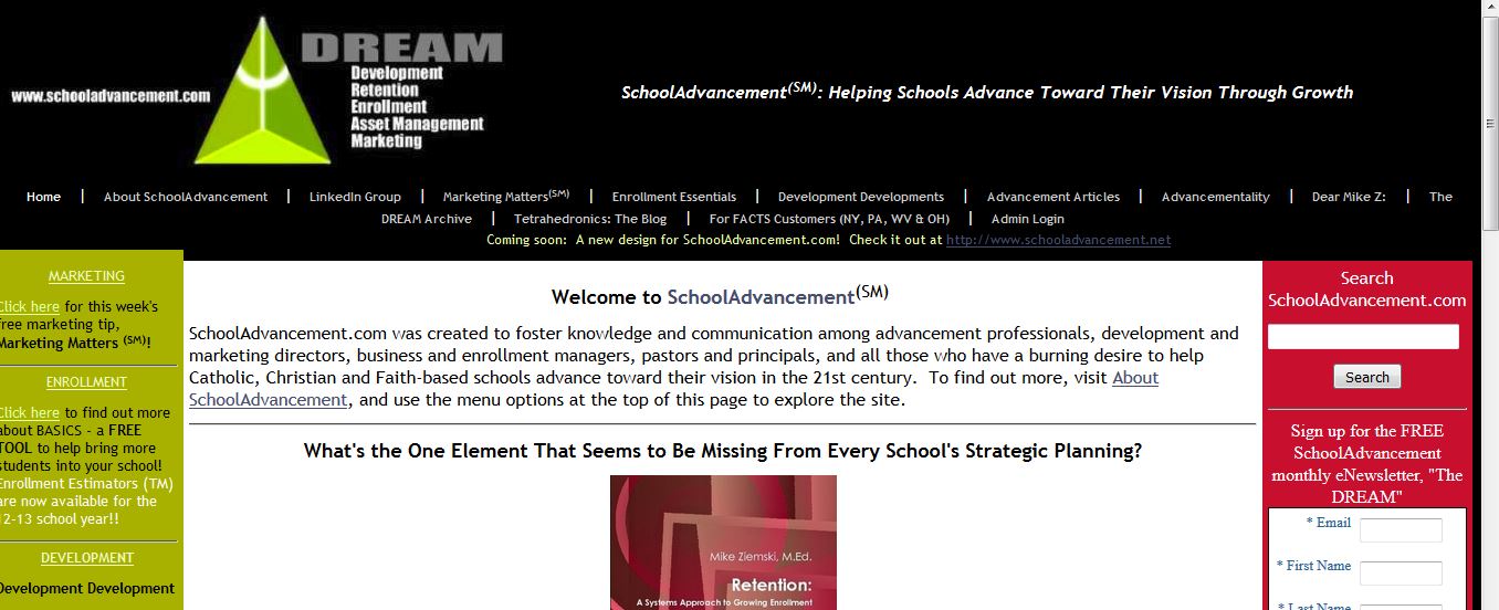 Sidebars on both left and right, top navigation and left side navigation, and lots of text, with only a few pictures. This Web site was stored on an external hard drive, and every time a new page was added, the whole site was re-rendered and uploaded to the site’s hosting space. Changes to it could only be made on one computer – the one which had the Web site creation program loaded on to it
In 2011, SchoolAdvancement.com’s first potential design change looked like this:
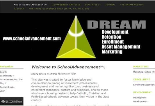 A little easier to read with more white space and a different font, but the design was essentially the same, with sidebars for additional navigation information or highlighted article sections. The top photo was only one of several which would rotate with others with a fade transition, spotlighting featured articles of the week or other items of note.
In 2016, SchoolAdvancement was redesigned again with a “modern, responsive design:”
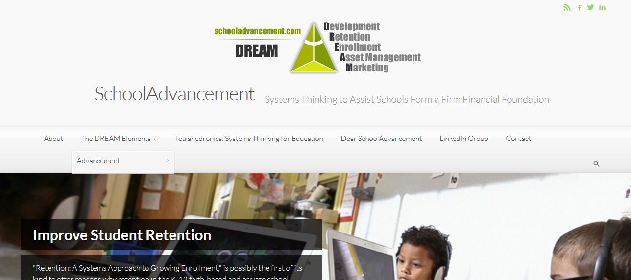 There was white space, a larger font with no serifs, and no sidebars. The site translates well to mobile devices (your tablets and phones) providing a better “experience” than a site that was designed to be viewed on a computer.
It used to be that scrolling was the cardinal sin of Web design, and that most of the pertinent information should be able to be viewed on the computer screen when the site loaded. If it could be designed so that no scrolling was necessary, that was a plus, and pages could be accessed with a mouse click from the drop-down menu of the navigation at the top or left of the page. As you can see, however, scrolling is now a critical design element, accomplished by a touch and a swipe of a finger on a mobile device, and access to links or additional information happens with a finger tap.
All that information that used to be in right sidebar is now at the bottom of the page.
What’s happened in the last 5 years? We’re now a mobile society. In 2011, it was a best practice for an entity to have two Web sites – one designed to be experienced on a computer, and one designed to be experienced on a mobile device, and sometimes, the mobile one was custom-designed into an app. As fast as that came along, by 2016, that was no longer a “best” practice. The new “best” practice was to design the site in a responsive manner so it adjusted to whatever type of device it’s being viewed on.
Best practice is Web design has changed once again, and designers create sites with “mobile first” in mind. It’s indeed responsive, but now you need two sites again – or, more correctly, a site and an app. It’s not because of the device being used to view the site as it was 10 years ago, it’s due to your audiences. Your school’s Web site is for an external audience – donors, parents of prospective students, the media, etc. It shares the successes of your school, and an invitation to join in the experience of the school. The app is specifically designed for your current parent community so they don’t have to go to the school’s Web site and then log in for what they need. The app resides on their phone or tablet and is their connection to the school.
Now you see why “Best” Practices are only “Best” until the “Next” best thing comes along. In that spirit, SchoolAdvancement will soon be posting a new series of articles called “Next Practice Insights.” More information is coming!
Your school’s Web site is not only its “face” today, but it’s a marketing tool to increase enrollment, as well as a repository for school information, and a place to generate revenue. About six years ago, Devin Mathias authored a blog called “More Donors,” and offered these recommendations as to what every “charity” Web site should have. Since your school is a non-profit organization, your site should have these pages. The descriptions have been modified so they fit a school’s educational mission.
1) Donation page
One of the goals of your school’s Web site is to increase constituent engagement with your school, and when that engagement is deepened, the Web site is a convenient place for those engaged with your school to contribute funding. Even though the Web site has functions, such as sharing your stories, illustrating your good work, and recruiting volunteers, you always want to make it easy for your constituents to support your school. This a “make a gift” button goes directly to the giving form, not to the general giving page or a why-to-give page. The form is where gift amount and credit card/banking information is entered. You can also use a trusted and secure third-party payment processor for contributions.
2) Giving page
As mentioned above, this is a different page from the one where constituents actually make the gift. This is the page which illustrates why your organization is worthy of support (which may tie into items #3 and #5), different methods for giving, etc. You should also provide direct contact information to your site’s visitors.
3) Impact page
Illustrate the actual impact your school is making, including testimonials, pictures, videos, etc. This is critical for current donors to see and to make future donors feel like they can make a difference by supporting you with their contributions of time, talent or treasure.
4) Action page
Some people, particularly younger generations, are inclined to give of their time rather than their treasure. The action page is a great way to get them involved, even if they can’t come to your Parent/Teacher meetings. Is there a petition they should sign? A letter they should write? Friends they should invite to support your school (note: not buy something to support the fundraiser-of-the-month)? Attend an event? Have a page that gives them easy ways to get involved.
5) Mission / Vision / Goals
This should go without saying, but you need to clearly articulate the vision for your school, and how you’re planning on getting there through the tangible goals you have in your sights. ( See #9.) While experts have grouped Mission, Vision and Goals together, they frequently leave out “Case” – the “why” of your existence, and your differences which make you school worthy of continued engagement and support.
6) Social Media page
Use icons for Facebook, Twitter, YouTube, Flickr, etc. and have a specific landing page with further details on your various social media profiles, campaigns and the people helping with your social media efforts. Recall that a number of years ago, schools were mindful of the dangers of social media regarding children. However, it’s utilization is a necessity if you’re looking to connect with lost alumni.
7) Privacy Policy
Concern for privacy of data is high today, and rightfully so. Therefore, a privacy policy is the helpful and responsible thing to post. Visit http://www.iubenda.com/en/privacy-legal-requirements regarding the importance of having a privacy policy, especially because Web sites today may have analytics and cookies which store certain amounts of information about your site’s visitors.
8) Contact Us
This is a critical and somewhat obvious page, but there are schools that have made contact information challenging to find (and sometimes, as challenging to find as the front door to their school). Additionally, provide multiple methods for contact. Email and phone are most critical, but it is also good to have various types of contacts – those for giving information/questions, and appropriate administrative contacts. Include your business address and a map or directions, too. You’re going to want prospective parents to tour the school, and the easier you make it for them to get there, the more your school will be perceived as an inviting place to learn and grow.
9) About Us
This should sum up why your school exists (it’s “case”, what your vision for the school is (where it’s going). It helps to remember that “what” and “who” describe your school’s mission, so see #5. Perhaps you can have these two pages combine into one to make information about your school accessible in one place.
10) Frequently Asked Questions/FAQ/Q&A
This is one of the most common pages on any website – for good reason. This can save you time by answering questions for your constituents before they reach out to you and your team. But, as previously mentioned, one of those questions should not be, “What does it cost to enroll my child?”
Bonus: 11) Blog.
Your school’s blog serves as the foundation for engaging donor stories, impact stories and your social media’s content development. Today’s parents and guardians want interaction, and want to feel personally connected to your school. A blog helps them do that when they are able to comment on what you’ve written. Write something every day – it’s one way to keep your overall Web site always fresh. If you end up combining numbers 5 and 9 as listed above, this is your #10.
© Michael V. Ziemski, SchoolAdvancement, 2011-2021 (Original Publication Date: 20110103)